


MOBILOOK — Mobile View & Mobile‑Friendly Test
In an era where mobile usage dominates internet traffic, it is crucial to have a mobile-friendly website. Ensuring your website meets mobile-friendly criteria is a key factor in online success, both for users and search…

Safe pick
Yes — MOBILOOK is a safe, well-maintained plugin to use in 2026. It runs on 1K+ sites, is rated 4.9/5 and was last updated 2 weeks ago, and scores 87/100 on our health check.
- Loved by users — 4.9/5 from 27 reviews
- Actively developed — last update 2 weeks ago
- Tested with the latest WordPress (7.1)
How does it stack up?
Side-by-side on installs, updates, ratings & support


Daily downloads
Download spikes usually follow a new release — each site that auto-updates counts as a download.
Rankings
Where MOBILOOK stands todayWordPress.org search rankings
Live position in the plugin search, top 100| Keyword | Position |
|---|---|
| android | #37 |
| iphone for Mobilook | #1 |
| mobile | #22 |
| responsive | >100 |
Version adoption
Share of active sites per release.
Rating breakdown
★★★★★★★★★★ 4.9 from 27 reviews
About MOBILOOK
From the official readme · v2.1.3Description
In an era where mobile usage dominates internet traffic, it is crucial to have a mobile-friendly website. Ensuring your website meets mobile-friendly criteria is a key factor in online success, both for users and search engines.
What You Should Know:
- Mobile web traffic currently represents 60.67% of global internet traffic, while desktop traffic accounts for 39.33% (StatCounter, 2024) (DataReportal – Global Digital Insights).
- Mobile searches constitute over 60% of all Google searches (Google, 2024) (DemandSage).
- The use of mobile devices to access the internet continues to grow, with over 92% of internet users preferring to use a mobile phone for browsing (DataReportal, 2024) (DemandSage).
- In 2024, there are more than 5.3 billion mobile internet users worldwide, and this number is expected to reach 5.8 billion by 2026 (DemandSage, 2024) (DemandSage).
Overview:

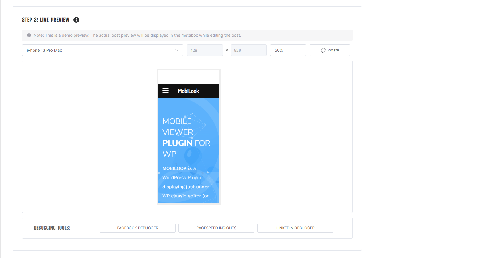
The MOBILOOK (Mobile View) plugin, an extension of Google DEVTOOL, allows you to instantly check the responsive design of your pages, articles, or products on mobile in various formats (Apple, Samsung, Google devices).
Once installed, MOBILOOK (Mobile View) is deployed on each of your pages. A section appears just below the WordPress Content Editor; once your content is published, it immediately shows you the mobile rendering based on the format you have defined.
There’s no longer a need to check what your site looks like on your mobile to see if it’s well suited to phones, tablets, and other media (responsive).
PRO Features
MOBILOOK PRO (Mobile View) offers several features:
- Activation of the plugin for all custom post types, including WooCommerce products, to instantly see if the product page design is responsive.
- Activation of additional formats – The PRO version gives you access to a large list of mobile/tablet formats (17).
- Activation of three very useful features:
- Facebook Debugger allows your pages to be crawled by Facebook’s bots to generate up-to-date OpenGraphs.
- Pagespeed.dev analyzes your page to identify if it meets all efficiency criteria.
- Mobile SEO (site zoom on mobile) – This feature adds an optimized viewport meta tag on all your pages, allowing users to zoom with mobile browsers.
Available Device Formats (Mobile View)
- (FREE) iPhone 13 Pro Max – 428 x 926
- (FREE) Samsung Galaxy S22 Ultra – 308 x 720
- (FREE) Google Pixel 6 Pro – 412 x 915
- (PRO) iPhone 12 – 390 x 844
- (PRO) Google Pixel 5 – 393 x 851
- (PRO) OnePlus 9 Pro – 321 x 711
- (PRO) Samsung Galaxy Note 20 Ultra – 308 x 720
- (PRO) iPhone 11 – 414 x 896
- (PRO) Samsung Galaxy S21 – 320 x 720
- (PRO) Xiaomi Mi 11 – 320 x 720
- (PRO) Huawei P40 Pro – 264 x 1200
- (PRO) iPad Air (2022) – 820 x 1180
- (PRO) iPad Pro 12.9 inches (2021) – 1024 x 1366
- (PRO) Samsung Galaxy Tab S8 Ultra – 1848 x 2960
- (PRO) Microsoft Surface Pro 8 – 1368 x 912
- (PRO) iPad Mini (2021) – 744 x 1133
Why Is a Responsive Site Important for SEO?
Since April 2015, Google has officially rewarded mobile-friendly websites and penalized sites that are not mobile-friendly in its search rankings. A non-mobile-friendly site risks seeing its traffic drop significantly due to a decrease in its SEO ranking.
A responsive web design ensures that your site functions properly on all devices and screen sizes, offering an intuitive and satisfying user experience.
Explanation of the Tools:
- LinkedIn Post Inspector: This tool allows your pages to be crawled by LinkedIn bots to generate up-to-date OpenGraphs. When you share a link on LinkedIn, LinkedIn bots fetch images and other content information to generate a correct preview. This tool ensures that your content is correctly displayed with appropriate metadata, enhancing the visibility and appearance of your posts on LinkedIn.
- Pagespeed.dev: This tool analyzes your page to identify if it meets all of Google’s efficiency criteria. Unlike Google DEVTOOL, Pagespeed.dev provides insights into how Googlebot (Google’s spider) views your page, which is crucial for SEO. If your site passes the test, it means it is optimized for a mobile experience, which can improve its ranking in Google’s search results.
What Is a Responsive Site?
Responsive web design is the practice of building websites that work properly on every device and screen size, whether large or small, mobile or desktop. Responsive design focuses on providing intuitive and gratifying experiences for everyone. Google has increasingly pushed to ensure all websites are mobile-friendly because mobile searches have consistently risen since 2009 and finally surpassed desktop searches in 2018.
Installation
Installing manually
- Unzip all files to the
/wp-content/plugins/mobilookdirectory - Log into WordPress admin and activate the ‘MOBILOOK’ plugin through the ‘Plugins’ menu
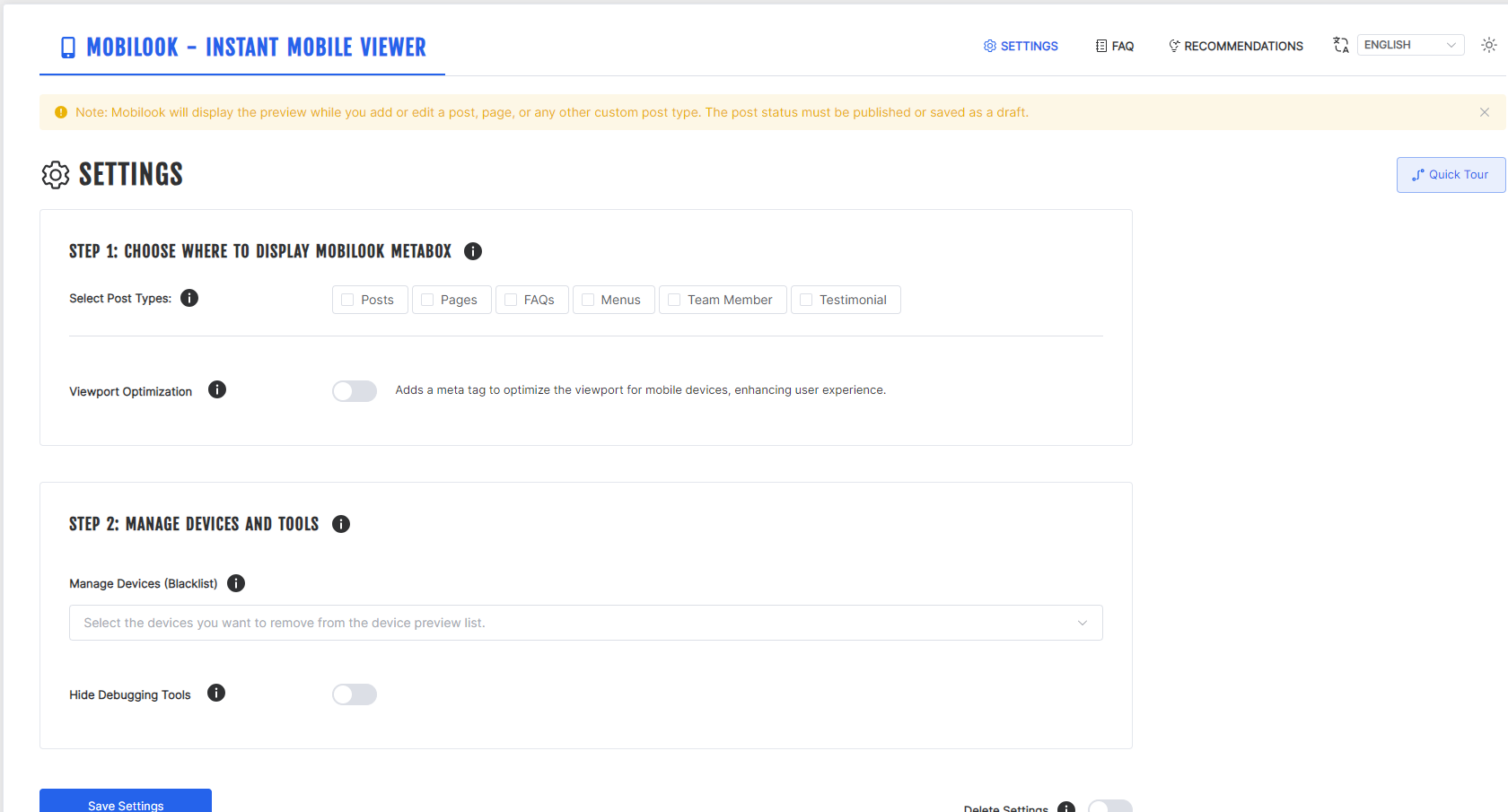
- Go to “Settings > Mobilook” in the left-hand menu to start work on it.
Changelog
2.1.3
- FIXED: Hardened ES module loading, stopped metabox assets on post lists, and contained the mobile preview without changing its logical viewport.
2.1.2
- NEW: Interface language now follows your WordPress site language (9 languages, incl. French & Canadian French). Full French translations for all plugin screens.
1.0.0
- Initial release.
1.0.1
- Added debugger tool
1.0.2
- Added Affiliate Program
1.0.3
- Fixed some styling issues
Screenshots
For developers
Is this your plugin? Show off the numbers.
Add a live badge to your site, docs or GitHub README. It updates on its own — no account needed.
Best MOBILOOK alternatives
All android plugins →




FAQ
MOBILOOK: quick answers
Straight answers, pulled from live WordPress.org data.
Live data from WordPress.org · checked Oct 1, 2026
Is MOBILOOK free?
Yes. MOBILOOK is free to download and use from the official WordPress.org plugin directory.
Is MOBILOOK safe to use in 2026?
Yes — MOBILOOK is a safe, well-maintained plugin to use in 2026. It runs on 1K+ sites, is rated 4.9/5 and was last updated 2 weeks ago, and scores 87/100 on our health check.
How many websites use MOBILOOK?
MOBILOOK is active on 1K+ WordPress websites and has been downloaded 56,719 times since it launched in May 2019. It was downloaded 724 times in the last 30 days.
Does MOBILOOK work with WordPress 7.1?
Yes. The developer has tested MOBILOOK up to WordPress 7.1.2, the latest release. It requires WordPress 5.0 or newer.
What PHP version does MOBILOOK need?
MOBILOOK requires PHP 7.4 or higher. Most hosts run PHP 8.x today, so it works on any modern WordPress hosting.
When was MOBILOOK last updated?
The latest version, 2.1.3, was released on September 18, 2026 (2 weeks ago).
Who makes MOBILOOK?
MOBILOOK is developed and maintained by Pagup.
What are the best alternatives to MOBILOOK?
The most popular alternatives to MOBILOOK are WPtouch (50K+ installs), Multi Device Switcher (20K+ installs) and Browser Theme Color (2K+ installs).
Powered by PageForge
Want thousands of pages that rank like these? Build them in an afternoon.
This directory runs on the same engine as PageForge. Turn any spreadsheet, CSV or API into thousands of fast, SEO-ready WordPress pages — with schema, internal links and AI-written copy baked in.
- CSV, Google Sheets & API data sources
- AI content, schema & internal links per page
- Works with Elementor, Gutenberg, Yoast & Rank Math
- Free on WordPress.org — no credit card