



Fluid Design System for Elementor
Create fluid typography & spacing presets natively in Elementor — no CSS clamp formulas, no breakpoints, just seamless responsive design.

Solid choice
Fluid Design System for Element… is a solid plugin choice in 2026, with a few things worth checking first. It runs on 300+ sites, is rated 5/5 and was last updated 3 days ago, and scores 76/100 on our health check.
- Actively developed — last update 3 days ago
- Tested with the latest WordPress (7.1)
- Momentum — downloads up 186.9% vs the previous 30 days
- Small user base (300+ active installs)
- Very few reviews so far
How does it stack up?
Side-by-side on installs, updates, ratings & support



Daily downloads
Download spikes usually follow a new release — each site that auto-updates counts as a download.
Rankings
Where Fluid Design System for Ele… stands todayWordPress.org search rankings
Live position in the plugin search, top 100| Keyword | Position |
|---|---|
| elementor | >100 |
| fluid | #2 |
| responsive | >100 |
| spacing | #25 |
| typography | #64 |
Version adoption
Share of active sites per release.
Rating breakdown
★★★★★★★★★★ 5 from 1 reviews
About Fluid Design System for Elementor
From the official readme · v2.6.0Description
Design once. Scale everywhere.
Fluid Design System for Elementor is a small yet powerful add-on that brings fluid typography and spacing presets directly into Elementor’s interface — helping you create fully responsive designs that scale naturally across every screen size, from tiny phones to ultra-wide desktops.
🎯 Think of it like color presets — but for padding, font sizes, and layout gaps.
With just a few clicks, you can:
– Define minimum and maximum values for typography or spacing.
– Apply those values using a new “fluid” unit inside any Elementor control.
– Watch your design scale smoothly—no coding or media queries required.
– Organize your presets into custom groups (e.g. “Border Radius”, “Thumbnail Sizes”) for better management.
Say goodbye to manually tweaking every breakpoint. Say hello to automatic, intelligent design scaling with organized preset management.
How It Works
❓ What Does “Fluid” Mean?
Traditionally in Elementor, you need to set separate values for each breakpoint — for example, one font size for desktop, another for tablet, and another for mobile.
While this gives some control, it has two major downsides:
– 🧩 It’s rigid: You only define styles for specific screen widths, leaving awkward gaps in between where the design may not scale smoothly.
– ⏱️ It’s time-consuming: Updating styles across multiple breakpoints for every section and element becomes a repetitive, manual process.
💡 Fluid Design System solves this.
Instead of setting fixed values for each breakpoint, you define just two—a minimum and a maximum — and the plugin automatically generates a smooth scaling behavior in between. This means:
– One preset handles all screen sizes.
– You get consistent design and spacing across the entire site.
– You save time and reduce manual effort.
– You can organize presets into groups for different projects or design systems.
This plugin introduces Fluid Units, powered by CSS clamp() and custom presets, allowing your design to scale automatically across all screen sizes.
Here’s how it works in real scenarios:
✍️ Fluid Typography Example
- Old way: 24px (mobile), 36px (tablet), 72px (desktop)
- Fluid way: One preset: min = 24px, max = 72px
- Result: Text scales smoothly and proportionally on all devices.
📦 Fluid Spacing Example
- Old way: 40px (mobile), 80px (tablet), 160px (desktop)
- Fluid way: One preset: min = 40px, max = 160px
- Result: Section padding adjusts naturally without breakpoints.
🔗 Fluid Gaps Example
- Gap between elements: 20px (mobile) to 60px (desktop)
- Result: Even spacing between containers and widgets on any screen.
❓ Why not Just Use vw or vh Units?
While viewport units like vw can scale elements based on screen width, they often lack control — your text might become unreadably small or overly large. The Fluid Design System solves this by generating clamp() values behind the scenes, so your designs stay within defined min/max boundaries. This gives you the flexibility of responsive scaling, combined with the precision of design tokens.
👉 Behind the scenes, the plugin creates CSS variables like: clamp(24px, 5vw, 72px) which Elementor then uses across typography, spacing, padding, margin, and more.
How to Use
Follow these steps to set up and use the Fluid Design System in your Elementor projects.
📐 Step 1: Configure Fluid Breakpoints
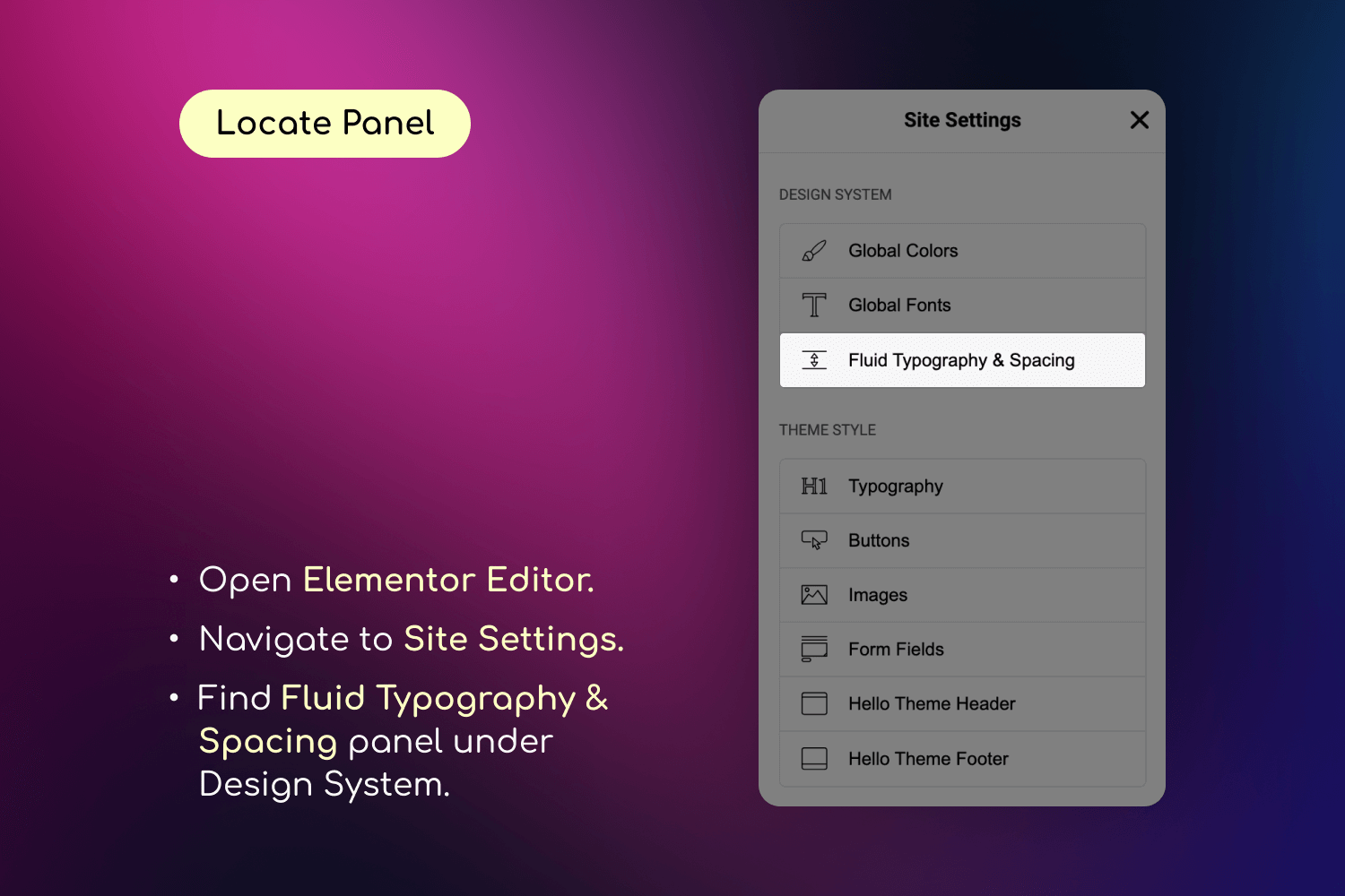
- Go to Elementor > Site Settings
- Navigate to the “Fluid Typography & Spacing” tab
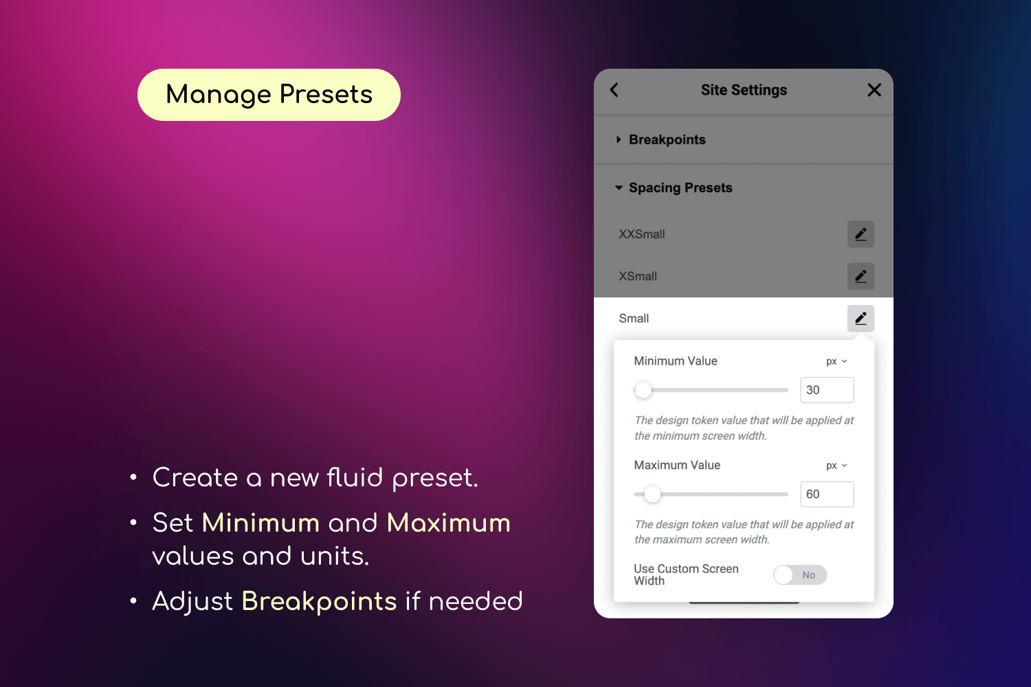
- In the “Breakpoints” panel, set your:
- Minimum Screen Width (e.g., 360px for mobile)
- Maximum Screen Width (e.g., 1920px for desktop)
🧰 Step 2: Create Your Presets
- In the same “Fluid Typography & Spacing” tab:
- Go to “Typography Presets” to create fluid font size presets
- Go to “Spacing Presets” to create fluid spacing presets
- For each preset:
- Give it a descriptive name
- Set minimum and maximum values
- Optionally set custom breakpoints for this preset
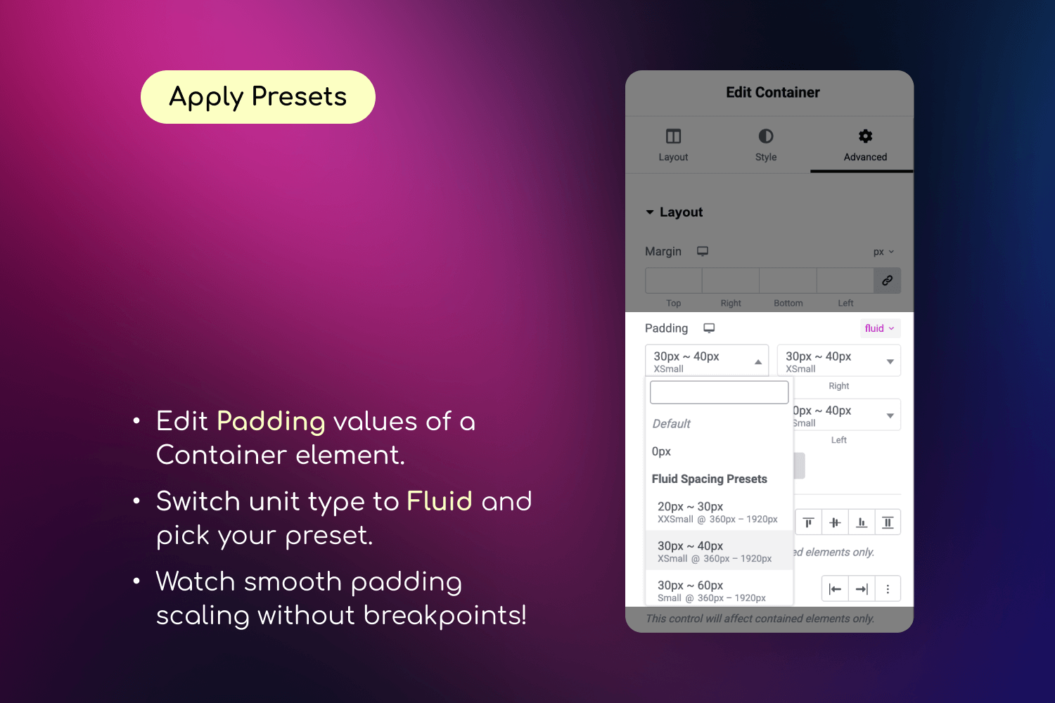
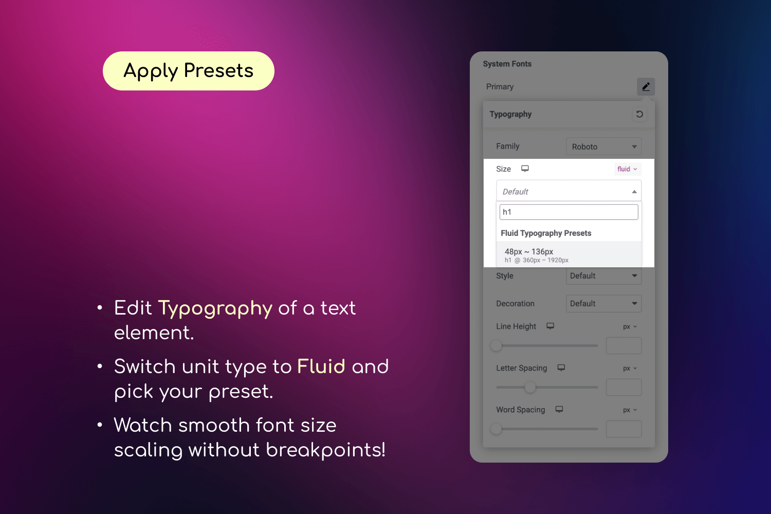
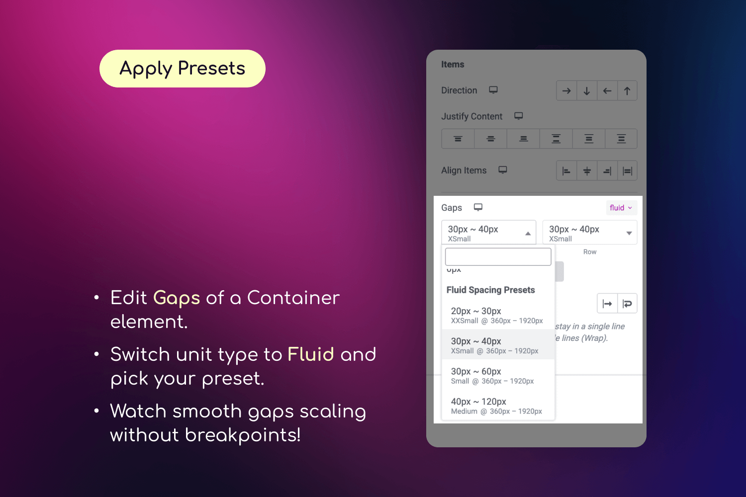
🎨 Step 3: Apply Your Presets
- Edit any page with Elementor
- In any control that supports custom units (typography, spacing, etc.):
- Select “fluid” as the unit
- Choose your preset from the dropdown
- Watch your design smoothly adapt to different screen sizes
🔧 Step 4: Fine-tune Your Design
- Use the live preview to see how your presets work
- Adjust preset values if needed
- Create additional presets for different design needs
Why Use Fluid Design System?
- Perfect Responsiveness: Create websites that look flawless on every device, from mobile phones to large desktop screens including all intermediate sizes
- Design Consistency: Maintain perfect spacing and typography harmony across your entire website
- Time-Saving: Eliminate manual breakpoint adjustments with intelligent fluid scaling
- Future-Proof: Seamlessly integrates with Elementor’s latest features and updates
- User-Friendly: Manage everything through Elementor’s familiar interface – no coding or CSS knowledge required
Key Features
- Inline fluid values – Set values directly in controls (“20px ~ 100px”) without visiting Site Settings
- Save as Preset – Convert inline values into reusable presets with one click
- Create unlimited fluid typography and spacing presets with custom minimum and maximum values
- Define global breakpoints or set custom breakpoints for individual presets
- Real-time preview of changes in the Elementor editor
- Works with all Elementor widgets and elements
- Compatible with any WordPress theme including Elementor’s Hello theme
- Full support for Elementor’s responsive controls and additional breakpoints
- Mix different units (px, em, rem) in your presets for ultimate flexibility
Common Use Cases
- Fluid Typography: Create responsive headings and text that maintain perfect proportions across all devices
- Consistent Spacing: Design section padding and margins that adapt smoothly to any screen size
- Responsive Grids: Build fluid grid layouts with perfect spacing between elements
- Typography Scale: Set up a complete typography system that works flawlessly everywhere
- Container Spacing: Create fluid containers that maintain perfect proportions on all devices
- Element Gaps: Design consistent gaps between elements that scale naturally
Installation
- Install and activate the plugin from the Plugins screen in WordPress.
- Make sure Elementor plugin is installed and activated
- Go to Elementor Editor > Site Settings > Fluid Typography & Spacing to create your presets
- Select “fluid” unit in Elementor controls to use your presets
- Once applied, your designs will fluidly scale across all screen sizes!
Frequently asked questions
Do I need to know CSS to use this plugin?
No coding or CSS knowledge required. Everything is managed through Elementor’s familiar interface.
Will this work with my Elementor widgets?
Yes! The fluid units are available in any Elementor control that supports “custom” units, including typography, spacing, paddings, margins, gaps and more.
Will this work with my current theme?
Yes! The plugin works with any WordPress theme, including the default Hello theme by Elementor.
Will this slow down my website?
No! The plugin uses Elementor’s native CSS generation system, ensuring optimal performance. The fluid calculations are done once during CSS generation, not during page load.
How is this different from using viewport units like `vw` or `vh`?
Viewport units (like vw) scale based on the entire screen width, but they have no upper or lower limit — which can lead to text or spacing being too small on mobile or too large on desktops. Fluid units in this plugin use CSS clamp() behind the scenes, which means you define a minimum and maximum value. The result scales smoothly between those values — giving you precise, predictable, and accessible designs across all screen sizes.
Can I use different units (px, em, rem) in my presets?
Yes! You can mix different units in your presets, like using “3em” as a minimum value and “160px” as a maximum value.
Can I use custom breakpoints for different presets?
Yes! You can set global breakpoints or define custom breakpoints for each individual preset. The default values (360px to 1920px) are just suggestions – you can set any values that work best for your design.
Does this plugin support AI agents / MCP?
Yes. On WordPress 6.9+ with the MCP Adapter plugin active, the plugin registers a fluid-design-system MCP server for managing presets and preset groups. AI agents like Claude Code can list, create, update, move, and delete presets programmatically. See the Developer Reference for connection details.
What browsers are supported?
The plugin uses the CSS clamp() function, which is supported by all modern browsers, including: – Chrome 79+ – Firefox 75+ – Safari 13.4+ – Edge 79+ – Opera 66+ – iOS Safari 13.4+ – Android Chrome 79+
Changelog
Initial release of Fluid Design System for Elementor
2.6.0
- added: themes and plugins can register preset groups in code (
arts/fluid_design_system/registered_groupsfilter); these groups survive an Elementor Kit import and can’t be renamed or deleted by mistake - fixed: inline fluid values like “20px ~ 100px” didn’t scale when the site had no presets in any group
- fixed: “Save as Preset” in the editor showed an error although the preset was saved, and the MCP create-preset tool returned an unreadable reply, when Elementor’s CSS Print Method was set to Internal Embedding
- fixed: after undo or redo, a fluid control kept showing the old preset until the panel was reopened
- fixed: fluid controls and the “Save as Preset” dialog jumped in size while presets and groups were loading
2.5.5
- fixed: the number field stayed visible next to the preset dropdown when a control used the fluid unit
2.5.4
- improved: smaller plugin package and more reliable installation and update process
- improved: updated internal build tools and dependencies for improved stability and security
2.5.3
- improved: full compatibility with WordPress 7.1
2.5.2
- fixed: the preset dialog could be closed with the Escape key while saving, hiding save errors
- fixed: the Save button in the “Edit Preset” dialog could stay disabled on slow connections
- fixed: preset groups created outside the editor now appear in the save dialog without reloading
- fixed: retrying after a failed save could create duplicate presets
- improved: preset names display consistently after saving
2.5.1
- fixed: presets created or edited directly in the editor could disappear after saving Site Settings
- fixed: fatal error when Elementor is deactivated while the plugin is active (WordPress 6.9+)
- improved: overall stability and reliability
Screenshots
For developers
Is this your plugin? Show off the numbers.
Add a live badge to your site, docs or GitHub README. It updates on its own — no account needed.
Best Fluid Design System for Eleme… alternatives
All elementor plugins →





FAQ
Fluid Design System for Elementor: quick answers
Straight answers, pulled from live WordPress.org data.
Live data from WordPress.org · checked Oct 16, 2026
Is Fluid Design System for Element… free?
Yes. Fluid Design System for Element… is free to download and use from the official WordPress.org plugin directory.
Is Fluid Design System for Element… safe to use in 2026?
Fluid Design System for Element… is a solid plugin choice in 2026, with a few things worth checking first. It runs on 300+ sites, is rated 5/5 and was last updated 3 days ago, and scores 76/100 on our health check.
How many websites use Fluid Design System for Element…?
Fluid Design System for Element… is active on 300+ WordPress websites and has been downloaded 6,368 times since it launched in April 2025. It was downloaded 941 times in the last 30 days.
Does Fluid Design System for Element… work with WordPress 7.1?
Yes. The developer has tested Fluid Design System for Element… up to WordPress 7.1.3, the latest release. It requires WordPress 6.0 or newer.
What PHP version does Fluid Design System for Element… need?
Fluid Design System for Element… requires PHP 8.0 or higher. Most hosts run PHP 8.x today, so it works on any modern WordPress hosting.
When was Fluid Design System for Element… last updated?
The latest version, 2.6.0, was released on October 13, 2026 (3 days ago).
Who makes Fluid Design System for Element…?
Fluid Design System for Element… is developed and maintained by Artem Semkin.
What are the best alternatives to Fluid Design System for Element…?
The most popular alternatives to Fluid Design System for Element… are Ultimate Addons for Element… (2M+ installs), Essential Addons for Elemen… (1M+ installs) and Royal Addons for Elementor (600K+ installs).
Powered by PageForge
Want thousands of pages that rank like these? Build them in an afternoon.
This directory runs on the same engine as PageForge. Turn any spreadsheet, CSV or API into thousands of fast, SEO-ready WordPress pages — with schema, internal links and AI-written copy baked in.
- CSV, Google Sheets & API data sources
- AI content, schema & internal links per page
- Works with Elementor, Gutenberg, Yoast & Rank Math
- Free on WordPress.org — no credit card