


Block Responsive – Make Editor Blocks Responsive Easily
Transform any WordPress block into a fully responsive element with device-specific controls for mobile, tablet, and desktop optimization.

Solid choice
Block Responsive is a solid plugin choice in 2026, with a few things worth checking first. It runs on 800+ sites, is rated 5/5 and was last updated 2 weeks ago, and scores 71/100 on our health check.
- Actively developed — last update 2 weeks ago
- Tested with the latest WordPress (7.1)
- Momentum — downloads up 37.1% vs the previous 30 days
- Small user base (800+ active installs)
How does it stack up?
Side-by-side on installs, updates, ratings & support


Daily downloads
Download spikes usually follow a new release — each site that auto-updates counts as a download.
Rankings
Where Block Responsive stands todayWordPress.org search rankings
Live position in the plugin search, top 100| Keyword | Position |
|---|---|
| block visibility | #14 |
| block-editor | #61 |
| custom-styles | >100 |
| mobile-friendly | #42 |
| responsive design | #5 |
Version adoption
Share of active sites per release.
Rating breakdown
★★★★★★★★★★ 5 from 7 reviews
About Block Responsive
From the official readme · v1.1.2Description
Block Responsive is the ultimate WordPress plugin for creating mobile-friendly, responsive websites with Gutenberg blocks. This comprehensive responsive design tool gives you complete control over how your content appears across all devices, making it easy to build responsive layouts without any coding knowledge.
Perfect for creating mobile-responsive websites, this plugin automatically adds responsive breakpoints and device-specific styling options to every core WordPress block. Whether you’re optimizing for mobile SEO, improving tablet user experience, or fine-tuning desktop layouts, Block Responsive provides the responsive web design tools you need.
Key Features
📱 Display Controls
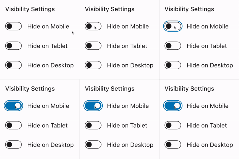
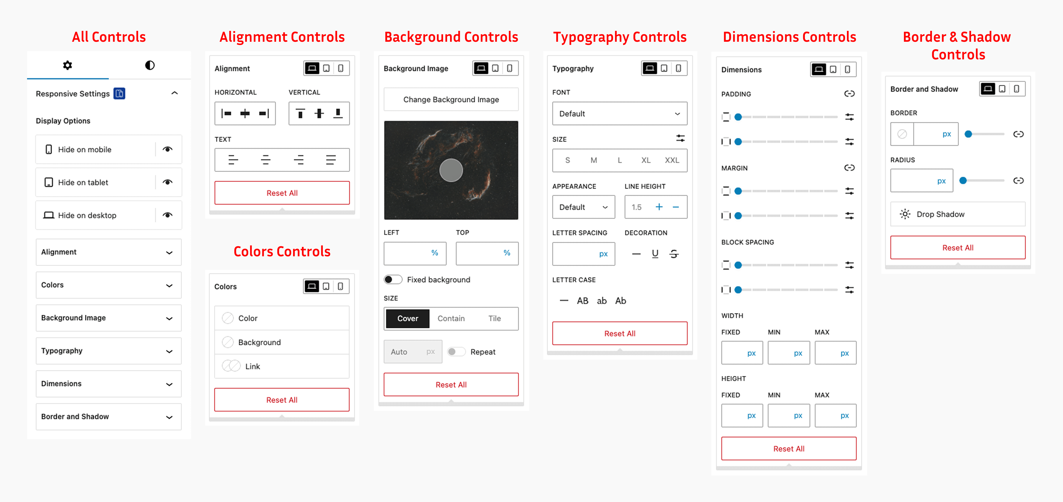
Hide/show blocks on specific devices (mobile, tablet, desktop)
Simple toggle controls with device-specific icons
Visual feedback for hidden blocks
🎨 Responsive Styling Options
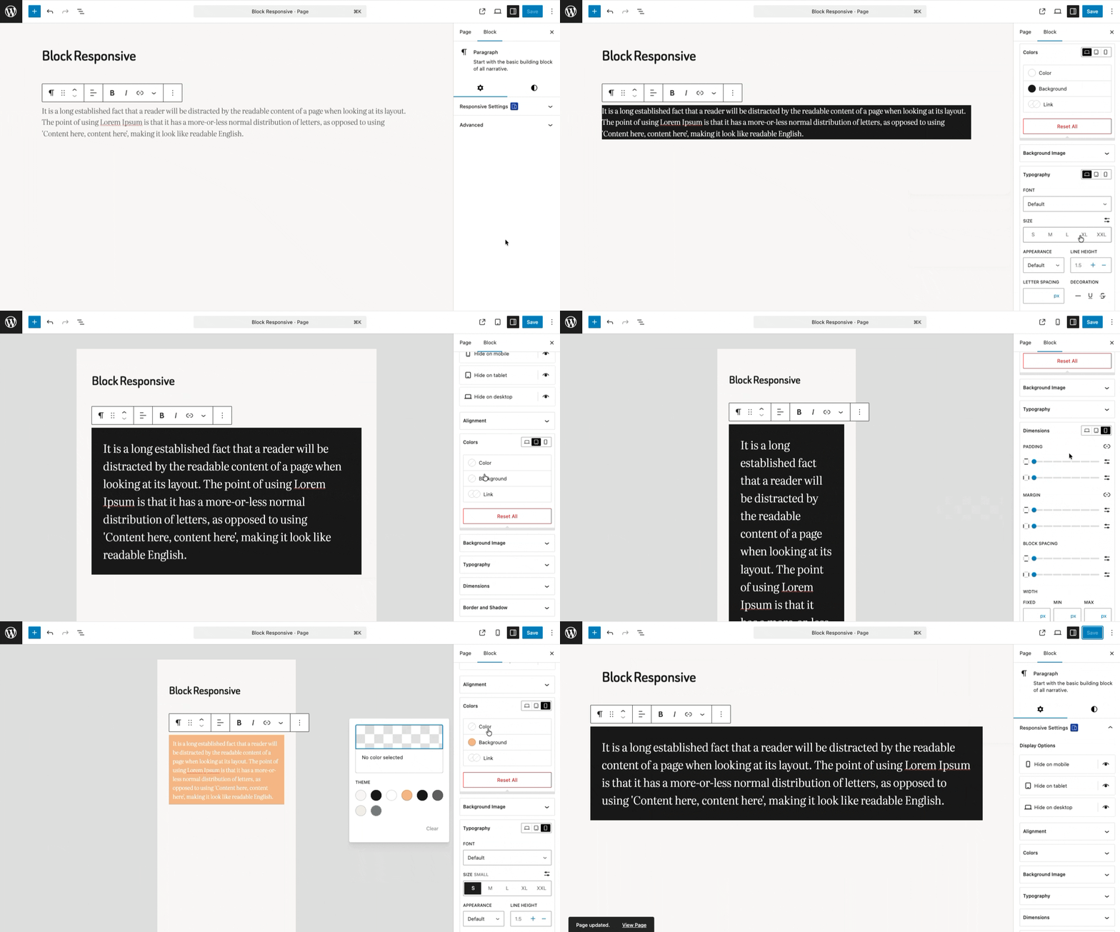
Alignment Controls: Block alignment settings for different screen sizes
Colors Controls: Text color, background color, and link color with device-specific settings
Background Image Controls: Responsive background image settings
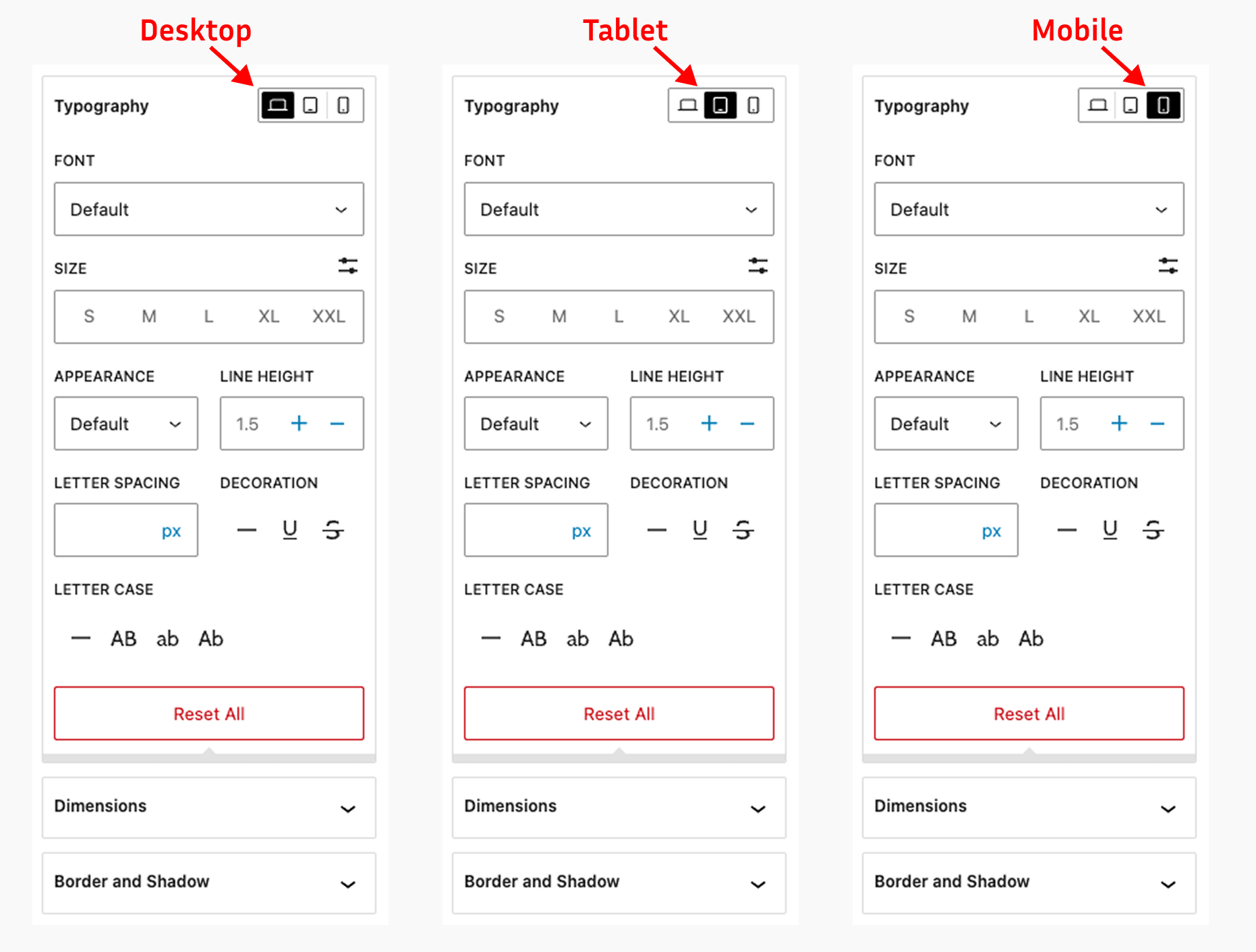
Typography Controls: Font size, line height, letter spacing, and text transform for each device
Dimensions Controls: Padding, margin, width, and height controls for responsive layouts
Border & Shadow Controls: Border radius, border width, and shadow effects per device
⚙️ Settings Dashboard
Manage the whole plugin from the new dashboard under Settings > Block Responsive:
- Custom breakpoints – define your own mobile and tablet breakpoints (defaults: 767px / 1024px) so your responsive design matches your theme perfectly.
- Per-block control – enable or disable the responsive controls for individual block types.
- User role permissions – choose which user roles are allowed to customize blocks.
- Import & export – move your plugin settings between sites with a JSON file.
How It Works
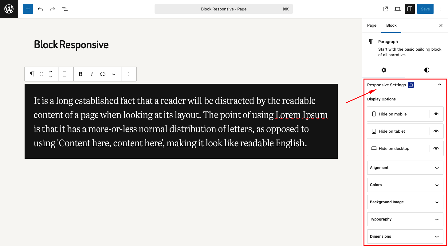
- Block Inspector Integration: Responsive controls appear in the block inspector panel
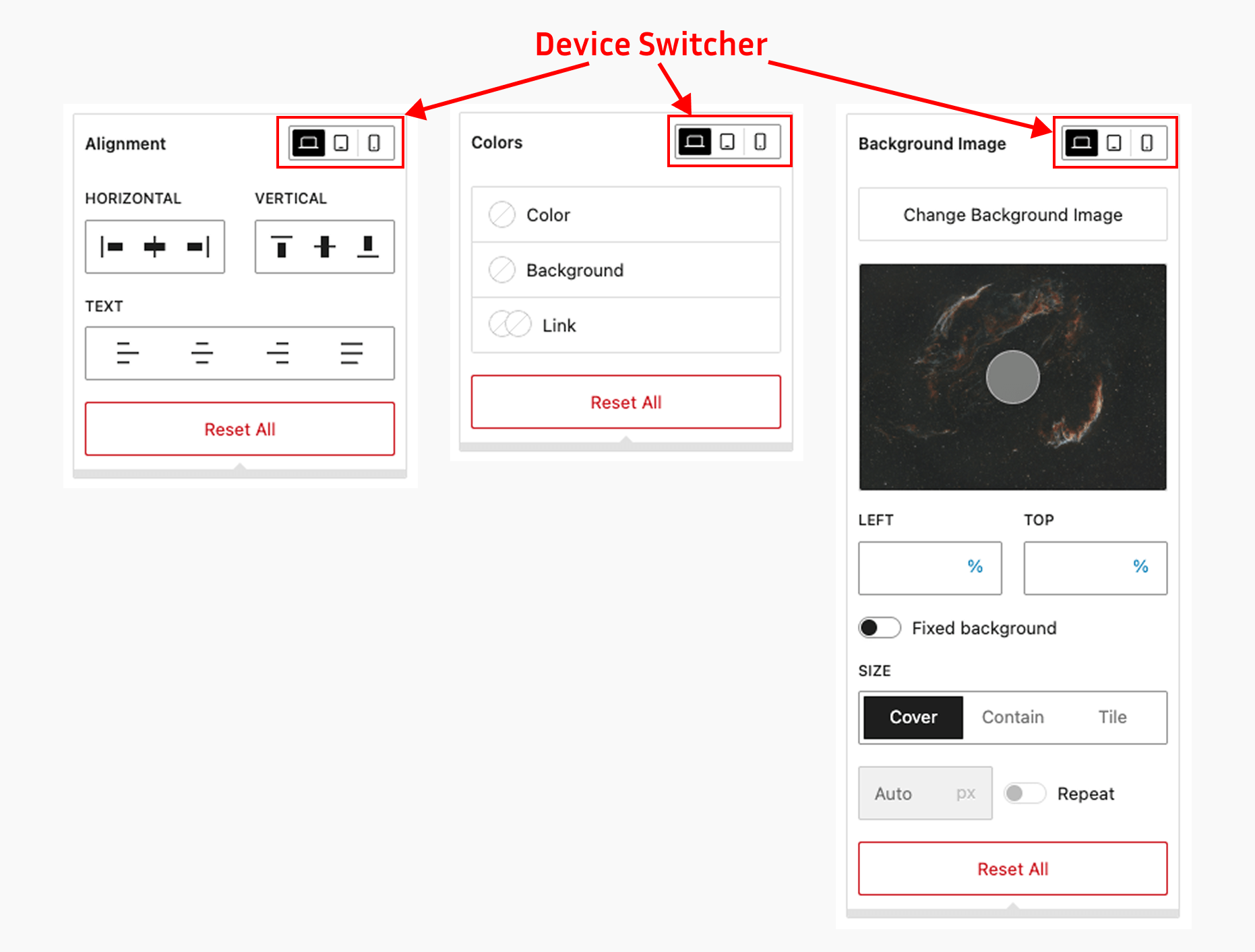
- Device-Specific Settings: Configure different styles for mobile, tablet, and desktop
- Real-time Preview: See changes immediately in the editor
- Frontend Rendering: Automatically generates and applies responsive CSS
Have feedback, suggestions, or feature ideas?
Feel free to share them with me at hello@ashrafuzzaman.com. I’d love to hear your thoughts!
Installation
Method 1: WordPress Admin (Recommended)
- Go to Plugins > Add New in your WordPress admin
- Search for “Block Responsive”
- Click Install Now and then Activate
Frequently asked questions
How do I access the responsive controls?
After activating the plugin, open any post or page in the Gutenberg editor. Select any block and look for the “Block Responsive” panel in the block inspector (right sidebar). You’ll see various responsive controls organized by category.
Which blocks support responsive controls?
The plugin works with all core Gutenberg blocks (blocks that start with “core/”) and WooCommerce blocks (blocks that start with “woocommerce/”). This includes paragraphs, headings, images, buttons, columns, product grids, cart blocks, checkout blocks, and many more.
Does this affect my existing content?
No, the plugin only adds controls to blocks. It doesn’t modify existing content unless you specifically use the responsive controls on blocks.
Is there a performance impact?
The plugin is optimized for performance. It only loads the necessary scripts and styles in the editor and generates minimal CSS for the frontend.
Can I disable responsive controls for specific blocks?
Yes! Since version 1.1.0, go to Settings > Block Responsive and enable or disable the responsive controls for each block type individually.
Can I change the mobile and tablet breakpoints?
Yes. By default the plugin uses 767px for mobile and 1024px for tablet, but you can set your own custom breakpoints from Settings > Block Responsive to match your theme’s responsive design.
Can I control which users can customize blocks?
Yes. From the settings dashboard you can choose which user roles are allowed to use the responsive controls in the block editor.
Can I move my settings to another site?
Yes. The settings dashboard includes import and export options, so you can download your configuration as a JSON file and import it on another site.
What happens if I deactivate the plugin?
Your content will remain intact, but any responsive styling applied through the plugin will no longer be visible. The blocks will display with their default styling.
Changelog
Responsive styles now target the same element as WordPress core styles (e.g. the button link instead of its wrapper). Blocks styled under the old behavior may look slightly different - please review pages that use responsive overrides after updating.
1.1.2
- Security: Stronger sanitizing of generated CSS.
- Fixed: All background color formats work (rgb, hsl, var, gradients).
- Fixed: Zero (“0”) values for typography and border are applied.
- Fixed: Duplicated or pasted blocks no longer share styles.
- Fixed: Undo reverts a responsive change in one step.
- Fixed: “Cover” background size can now be selected.
- Fixed: Importing an invalid file no longer resets settings.
- Fixed: Zoomed screens (e.g. 767.5px wide) now match a breakpoint.
- Update: WordPress build packages updated (@wordpress/scripts 35) and plugin rebuilt.
1.1.1
- Fixed: Border styling of the device toggle buttons in the editor UI.
- Enhance: Added compatibility with WordPress v7.1.
1.1.0
- New: Settings dashboard under Settings > Block Responsive.
- New: Custom mobile and tablet breakpoints (previously fixed at 767px/1024px).
- New: Enable or disable responsive controls per block type.
- New: Choose which user roles can use the responsive controls.
- New: Import/export of plugin settings as a JSON file.
- New: Order control (flex order) in the alignment settings.
- New: Indicators showing which devices have custom values.
- Enhance: Responsive styles now target the same element as core styles (e.g. the button link, not its wrapper).
- Enhance: Zero (“0”) values for spacing and border radius are now applied.
- Enhance: Faster CSS collection on classic themes (no double render).
- Fixed: Inline responsive CSS was output twice on the frontend.
- Security: Generated CSS values are sanitized; background URLs validated.
- Update: Settings are removed on uninstall; content is untouched.
1.0.5
- Fixed: Minor bugs and code improvements.
- Enhance: Added compatibility with WordPress v7.0.
1.0.4
- New: Compatibility with WordPress Site Editor
- Enhance: Added compatibility with WordPress v6.9.
1.0.3
- New: Responsive position and overflow controls
Screenshots
For developers
Is this your plugin? Show off the numbers.
Add a live badge to your site, docs or GitHub README. It updates on its own — no account needed.
Best Block Responsive alternatives
All block visibility plugins →

FAQ
Block Responsive: quick answers
Straight answers, pulled from live WordPress.org data.
Live data from WordPress.org · checked Sep 30, 2026
Is Block Responsive free?
Yes. Block Responsive is free to download and use from the official WordPress.org plugin directory.
Is Block Responsive safe to use in 2026?
Block Responsive is a solid plugin choice in 2026, with a few things worth checking first. It runs on 800+ sites, is rated 5/5 and was last updated 2 weeks ago, and scores 71/100 on our health check.
How many websites use Block Responsive?
Block Responsive is active on 800+ WordPress websites and has been downloaded 9,535 times since it launched in August 2025. It was downloaded 1,361 times in the last 30 days.
Does Block Responsive work with WordPress 7.1?
Yes. The developer has tested Block Responsive up to WordPress 7.1.2, the latest release. It requires WordPress 6.7 or newer.
What PHP version does Block Responsive need?
Block Responsive requires PHP 7.4 or higher. Most hosts run PHP 8.x today, so it works on any modern WordPress hosting.
When was Block Responsive last updated?
The latest version, 1.1.2, was released on September 19, 2026 (2 weeks ago).
Who makes Block Responsive?
Block Responsive is developed and maintained by Sheikh Ashrafuzzman.
What are the best alternatives to Block Responsive?
The most popular alternatives to Block Responsive are PublishPress Blocks (20K+ installs), Visibility Controls for Edi… (900+ installs) and Wicked Block Conditions (600+ installs).
Powered by PageForge
Want thousands of pages that rank like these? Build them in an afternoon.
This directory runs on the same engine as PageForge. Turn any spreadsheet, CSV or API into thousands of fast, SEO-ready WordPress pages — with schema, internal links and AI-written copy baked in.
- CSV, Google Sheets & API data sources
- AI content, schema & internal links per page
- Works with Elementor, Gutenberg, Yoast & Rank Math
- Free on WordPress.org — no credit card